mptcptrace demo
In this post we will show a small demonstration of mptcptrace usage. mptcptrace is available from http://bitbucket.org/bhesmans/mptcptrace.
The traces used for these examples are available from /data/blogPostPCAP.tar.gz . This is the first post of a series of 5 posts.
Context
We consider the following use case:
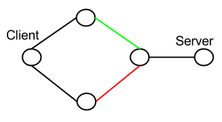
We have the client on the left that has two interfaces and two links to the server.
The green and red links each have well defined delay, bandwidth and loss rate. These links are respectively only used by the first interface of the client and the second interface of the client.
For our experiments, the client pushes a given amount of data at a given rate (at the application level) to the server.
For all the experiments the client sends 15000kB of data at 400kB/s. Experiments should always last at least 150/4 = 37s.
We use the fullmesh path manager for all the experiments. We also set the congestion control scheme to lia for all the experiments.
The rmem for all the experiments is set to 10240 87380 16777216
All this topologies are within mininet.
We analyze the client trace with mptcptrace with the following command:
mptcptrace -f client.pcap -s -G 50 -F 3 -a
but xplot files are not always easy to convert to png files, so we use:
mptcptrace -f client.pcap -s -G 50 -F 3 -a -w 2
to output csv files instead of xpl files and we parse them with R scripts.
First experiment
| Green: |
|
|---|---|
| Red: |
|
| Client: |
|
We collect the trace of the connection and generate the following graphs
To get a first general idea, we can take a look at the sequence/acknowledgments graph

The graph is composed of vertical lines for each segments sent and small triangles for each ack. The bottom of a vertical line is the start of the MPTCP map and the top of is the end of the MPTCP map. Since there are many segments and acks, it looks like a simple line, however the zoom bellow shows the segments and the acks. The color depends on the path. Here most of the data goes through the green path because the default MPTCP scheduler always choose the path with the smallest RTT as long as there is enough space in the congestion window. Because the green path can support the sending rate of the application alone, MPTCP does not need to use the red path. However we can see a small difference at more or less 20 seconds. Let’s zoom on this part.
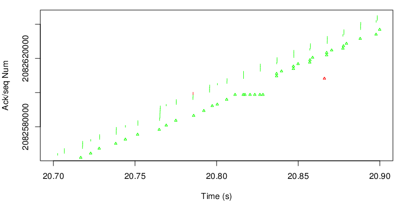
On this zoom we can see that MPTCP decides to send one segment on the red path. This may be due to a loss on the green subflow. Because the red path has a higher delay, segments sent by the green subflow after the red segment will arrive before at the client. In other words, green data will arrive out of sequence at the receiver. We see a series of duplicate MPTCP green acks before a jump in the acks. We can also see that the red ack takes into account data that has not been sent on the red subflow. This is an indication that some green segments arrive before the red segment. We can also observe that the red ack arrives late and acks data that are already acked at the MPTCP layer. This is due to delay on the way back for the red ack. Nevertheless this ack still carries a usefull ack for the TCP layer.
On the next figure, we take a look at the evolution of the goodput.

The cyan line shows the average goodput since the beginning of the connection while the blue line shows the average goodput over the last 50 acks (see the mptcptrace parameter). The blue line represents a more instantaneous value for the goodput. We could have a more instantaneous view by reducing the value of the G parameter in the mptcptrace command.