mptcptrace demo, experiment three
This is the third post of a series of five. Context is presented in the first post. The second post is here.
Third experiment
| Green at 0s: |
|
|---|---|
| Green at 5s: |
|
| Green at 15s: |
|
| Red: |
|
| Client: |
|
In this third scenario, the green link become lossless again after 15 seconds and its delay comes back to 10ms.
Again let’s see the evolution of the sequence numbers.
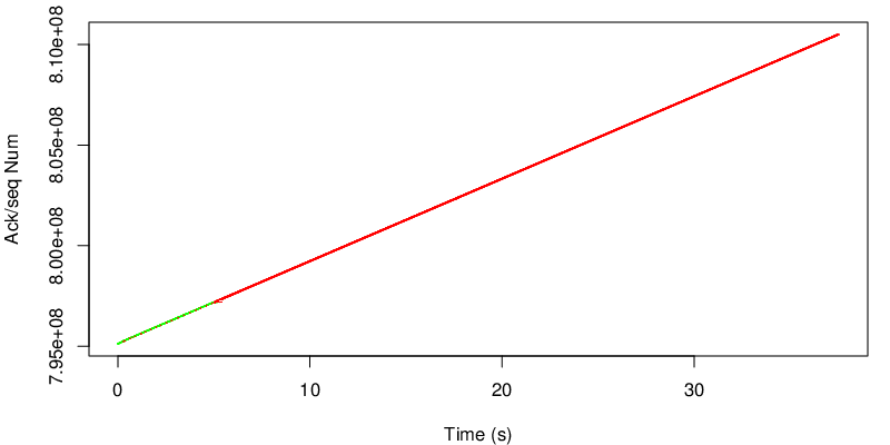
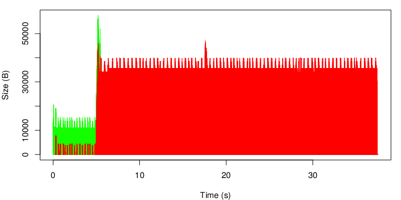
We can observer the same shift as the previous experiment from the green path to the red path after 5 seconds (see below). However, quite surprisingly, we can not see any shift after 15 seconds. Due to the many losses and the high delay between 5 and 15 on the green path, the green path may have a small congestion window and still have the same estimation of the RTT because no new traffic has been sent over the green subflow. No traffic has been pushed on the green subflow by MPTCP, because the red subflow, even though it has a longer delay, can still sustain the application rate. In conclusion, because MPTCP never probes the green subflow, it can not get any idea that this subflow could now be better.
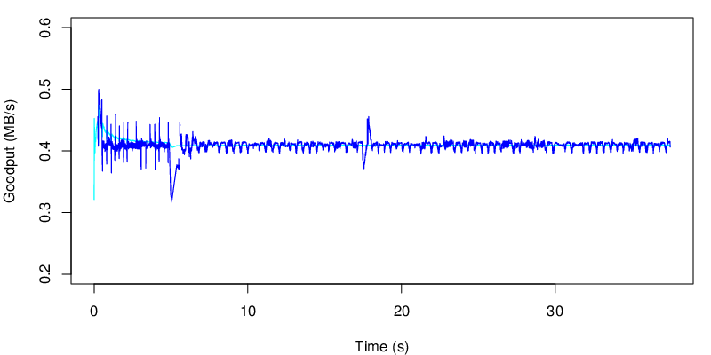
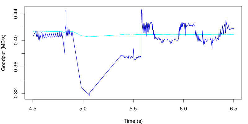
We can also take a look the goodput. We see the same perturbation at 5 second that we saw on the previous experiment. And we don’t see any any change around 15 seconds. It’s normal because MPTCP does not come back on the green subflow.
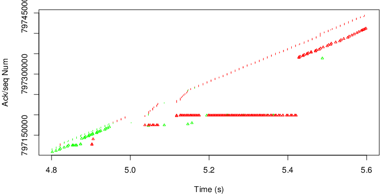
Again the zoom shows similarities with the previous experiment.
We can also take a look at the amount of data that is not yet acked from the perspective of the sender.

On this figure, the black line shows the evolution of the receive window announced by the receiver. The cyan line shows the amount of data that is not MPTCP-acked while the blue line shows the sum of data that is not TCP acked. If the blue line and the cyan line do not stick, this means that that segments arrive out of order (from the MPTCP sequence number view point) at the receiver
We can also look at the evolution of the tcp unacked data by subflow.
This graph shows the evolution of the unacked data at the TCP layer. We can observe that MPTCP either choose one path or the other but hardly never choose to use both at the same time. On this graph we can also observe the consequence of a longer delay on the red path : the amount of data on flight is higher.